
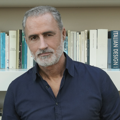
Interviews


Crossings
The luxury homes (villas, lofts and penthouses), shops and resorts designed by Carlo Donati Studio are characterised by a sense of crossing, of “passing through”. While this involves physical and visual transitions through living spaces, the firm’s investigations also focus on metaphorical intersections of different worlds. Their aim is to create interiors with a crossover effect that blends different styles as well as influences extraneous to the world of architecture, such as film, art, music and pop culture. The resultant projects are visually sophisticated and involve a skilful use of materials and colour schemes.
What are the most distinctive aspects of your practice’s research?
Our most distinctive quality is the fact that our design choices challenge standardisation, status symbols and globalisation. When we design commercial and above all luxury residential spaces, we do everything we can to resist the tendency to conform to an international language that results in repetitive projects lacking personality. In this pervasive and standardised approach, an interior designed for the Bosco Verticale or the Solaria Tower in Milan ends up being very similar to an interior in Hong Kong. It has nothing to do with the aesthetic criteria of beauty or ugliness. I would define this approach as “kitsch”, not in the sense of “tasteless” but in the meaning that Gillo Dorfles assigned to the term, i.e. a surrogate, a slavish repetition of a given concept.
Our philosophy is to create unique projects with a strong personality, which we do by talking to the clients, getting to know them and bringing out the innermost aspect of their personality.
And then how do you proceed?
For each project we create a moodboard, a kind of preliminary “palette” consisting of analogue references based on our individual imagination, a set of imagery we have built up over years of experimentation, which we then adapt to the identity of the location and the client’s requirements in terms of comfort.
What does this customised moodboard consist of?
We create the moodboard on the basis of discussions with the client, but it is also influenced by the context. This generates a series of cultural iconographic references, which we combine with other ideas to arrive at the final product in an almost natural way. Then in the end I might discover that the project contains references to the crystallised atmospheres of Bob Wilson’s set designs, to Carlo Scarpa’s materials, to the Space Age or to the blood red colour of Bacon’s paintings, icons that are all part of my individual imagination.


Your interior decoration projects are clearly influenced by trends, while retaining a strong personality.
Our projects display an evolution of taste that fits in with current trends, even though we may not realise it. But we certainly also try to propose contrasting solutions: combining the rigorous with the saturated, juxtaposing minimalist rarefaction with decorated wallpapers, for example. We always try to maintain our own distinctive character. The two decades around the turn of the millennium were almost entirely dominated by the minimalist trend, after which there was a physiological split from this style and between 2010 and 2020 a shift towards saturated colours and more soothing tones such as teal blue. We are now seeing a preference for more delicate shades such as pink, light blue and salmon, a trend I refer to as the “new pastel”. We too have used this colour palette, proposing it to a client by means of a photo of David Bowie with his orange hair, blue and pink make-up and sky blue jacket!
You mentioned “contrasting solutions” in the use of materials. How do you apply this to your projects?
The basic idea is to decorate using materials, albeit in a non-traditional way. For example, we might combine a strongly-veined marble with resin or iron to create a powerful sense of contrast, thereby juxtaposing an industrial look with a minimalist decorative style. Another very interesting effect might be to place an industrial micro perforated sheet metal alongside ribbed wood inspired by Gio Ponti during his golden years. In any case, the idea is to try to create a kind of short circuit.
For example, in the project for The Skyscraper we contrast black iron with walnut wood, whereas in Time Capsule we combine ribbed wood with copper and iron metallic elements. And for the entrance to the Lineshades penthouse, we created a 1950s style brass frame to accommodate a custom-designed furniture unit in which the textures of ribbed wood alternate with those of bronze-coloured industrial micro perforated sheet metal.
Have you ever used ceramics to create contrasts in your projects?
We have created ceramic floors combined with resin and iron. To tell the truth, I was wary about the use of ceramic tiles until a few years ago because unlike today, there was a lack of in-depth cultural investigation into this material. The development of ceramic materials has gathered pace recently. For years, ceramic tiles tended to be quite basic, then they began to imitate stone and marble. I find it interesting that some brands have recently been doing a lot of research into sizes and patterns.
I have often observed that the materials you choose for your projects reference the location. For example, the colours and materials chosen for your projects in Milan are based on a modern interpretation of 1950s design.
The Skyscraper is an apartment located in the Breda Tower, a historic Milanese skyscraper designed by Luigi Mattioni and the Soncini brothers according to avant-garde technical and functional criteria. In 1955 it was the tallest reinforced concrete building in the world. During demolition work, we found an astonishing brightly coloured original terrazzo floor underneath the existing flooring. We decided to restore it and it is now a key element in the project. The recessed spotlights in the ceiling echo the circular shapes of the floor design. The living room features 1950s-style ivory-coloured ribbed wood panelling. All the furnishings were custom-designed by our practice, starting with the kitchen which includes an island supported by a black waxed iron frame. The P19 building constructed in the city-centre Brera area references post-war Milanese architecture and fits into the context by proclaiming its contemporaneity. It is characterised by natural stone cladding and the separation of the inward sloping ground floor, which contrasts with the projection of the outward sloping corner balconies. The elevation facing towards the Basilica of San Simpliciano is defined by large terraces with a rationalist flavour. The lobby features bronzed perforated sheet metal panelling and a fully glazed street front, allowing the interior to communicate with the city. In keeping with the Milanese tradition of collaboration between architects and artists in high-end buildings, a site-specific painting by the artist Petrus represents an abstraction of the building’s accentuated diagonal lines and the colours of the adjacent blade shaped glass volume.
You carry out the same kind of research in locations by the sea and in the mountains.
In the Nero Mediterraneo villa overlooking the Gulf of Policastro, we find the dark volcanic stone colours typical of the Aeolian Islands and strong contrasts with the reflections of the sea. The dark tones of the palette are combined with Basaltina lava stone, Nero Assoluto granite, burnished brass and smoky grey plaster for the walls. In Saint Moritz, the cobblestones and animal troughs are made from green travertine, so when designing a mountain home we opted for rough green travertine slabs combined with burnished brass in place of the more customary parquet flooring. However, I’m not obsessive about matching materials to the context. For example, we designed a modernist villa in an anonymous residential area of Lodi where I chose not to adhere to the style of the location.
April 2023
BIOGRAPHY
BIOGRAPHY
Carlo Donati Studio focuses mainly on the design of exclusive homes, shops and resorts. After acting as an architectural consultant for the Gianni Versace, Aldo Coppola and Liberty of London brands, the firm is currently in charge of art direction for Slowear and has designed showrooms in Paris, London, Tokyo and Seoul. It recently designed a new residential building and service volume in Milan’s Brera District. In 2008, the practice won the competition for the masterplan of Segrate, Milan. Carlo Donati has been invited to give lectures at the Milan Polytechnic and to lead refresher courses for architects on interior design and residential projects.
