


Projects


Material continuity as a design principle
Claudia Capperucci
Francesca Vinci
Studio Eigen
CAESAR
2025
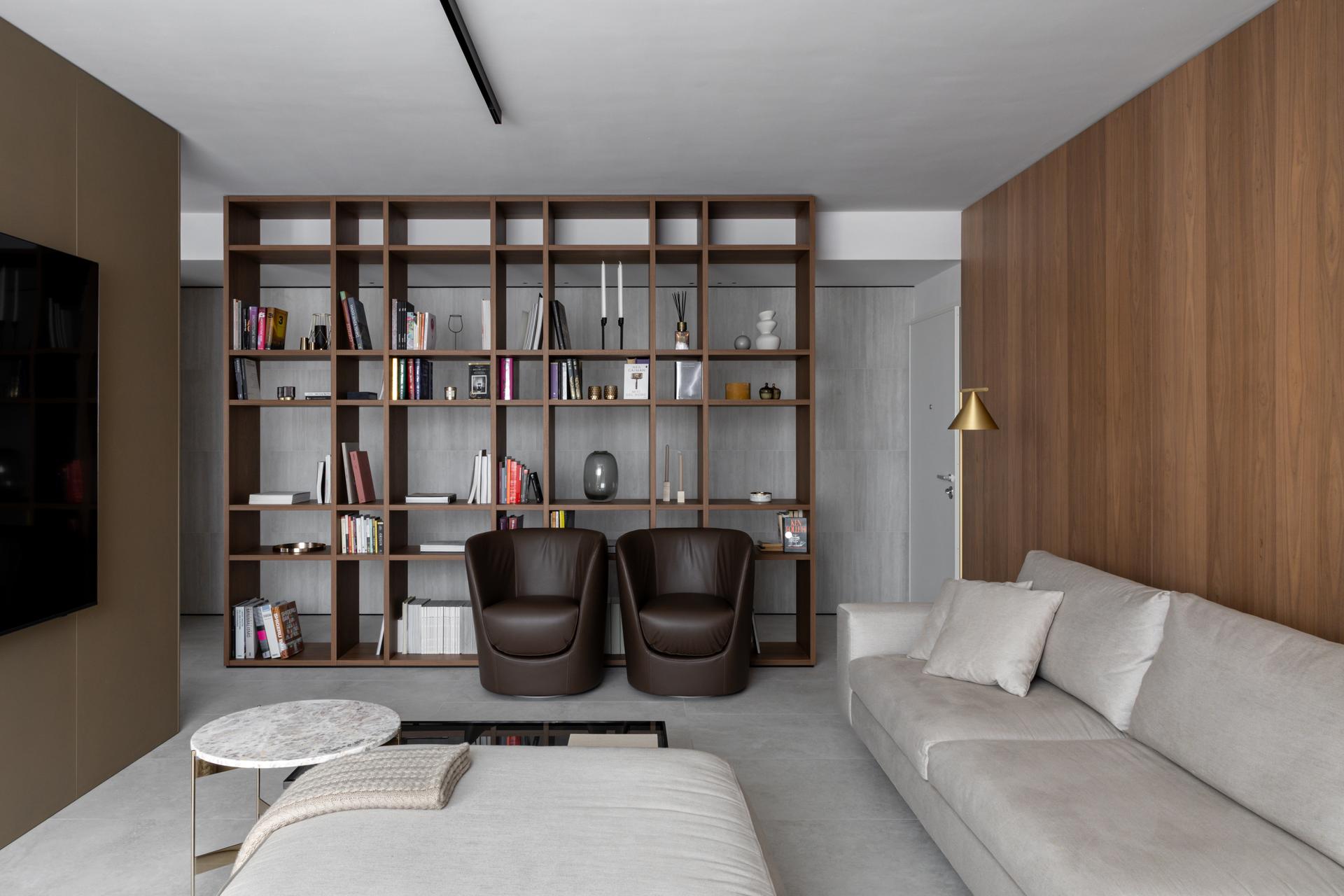
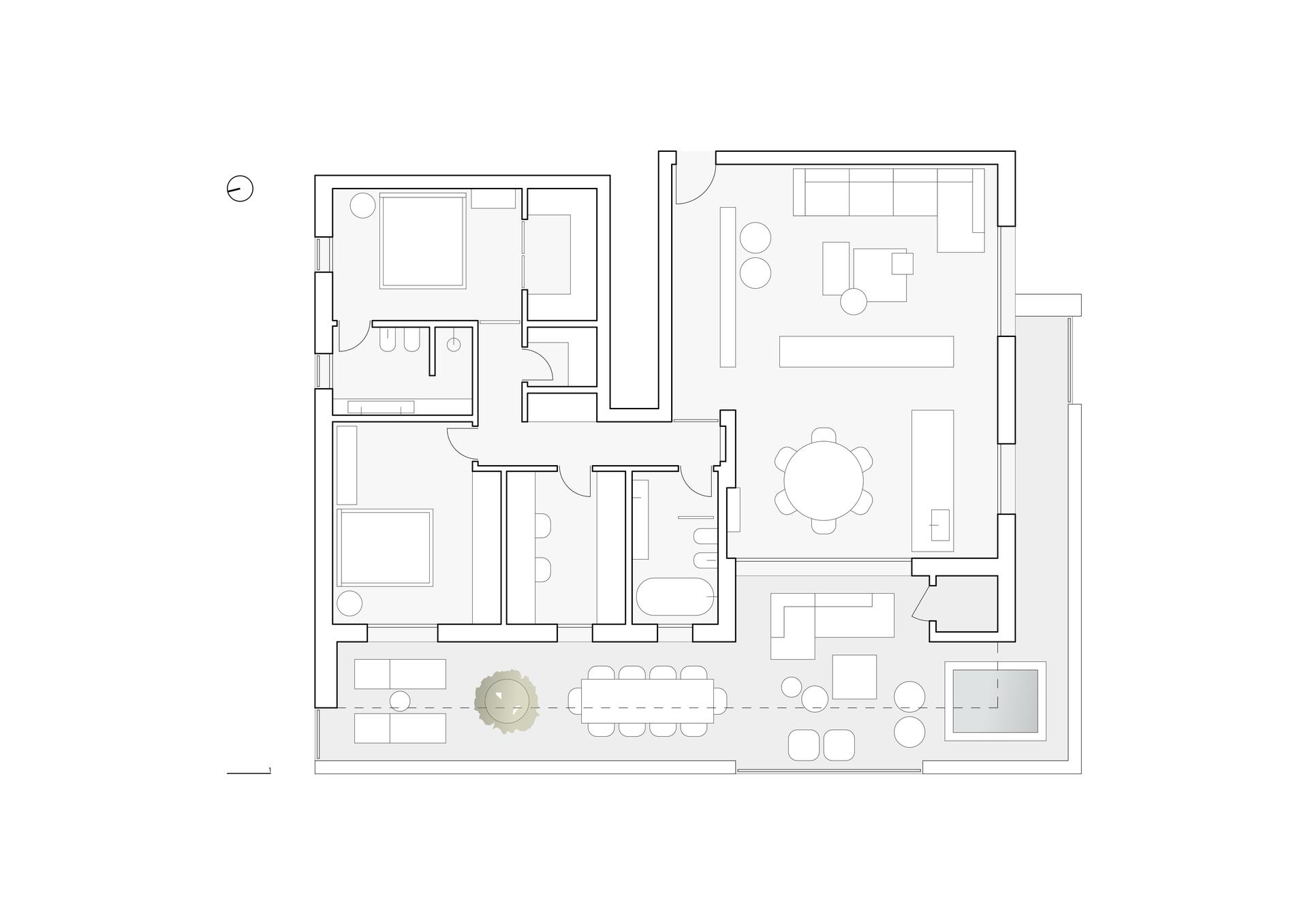
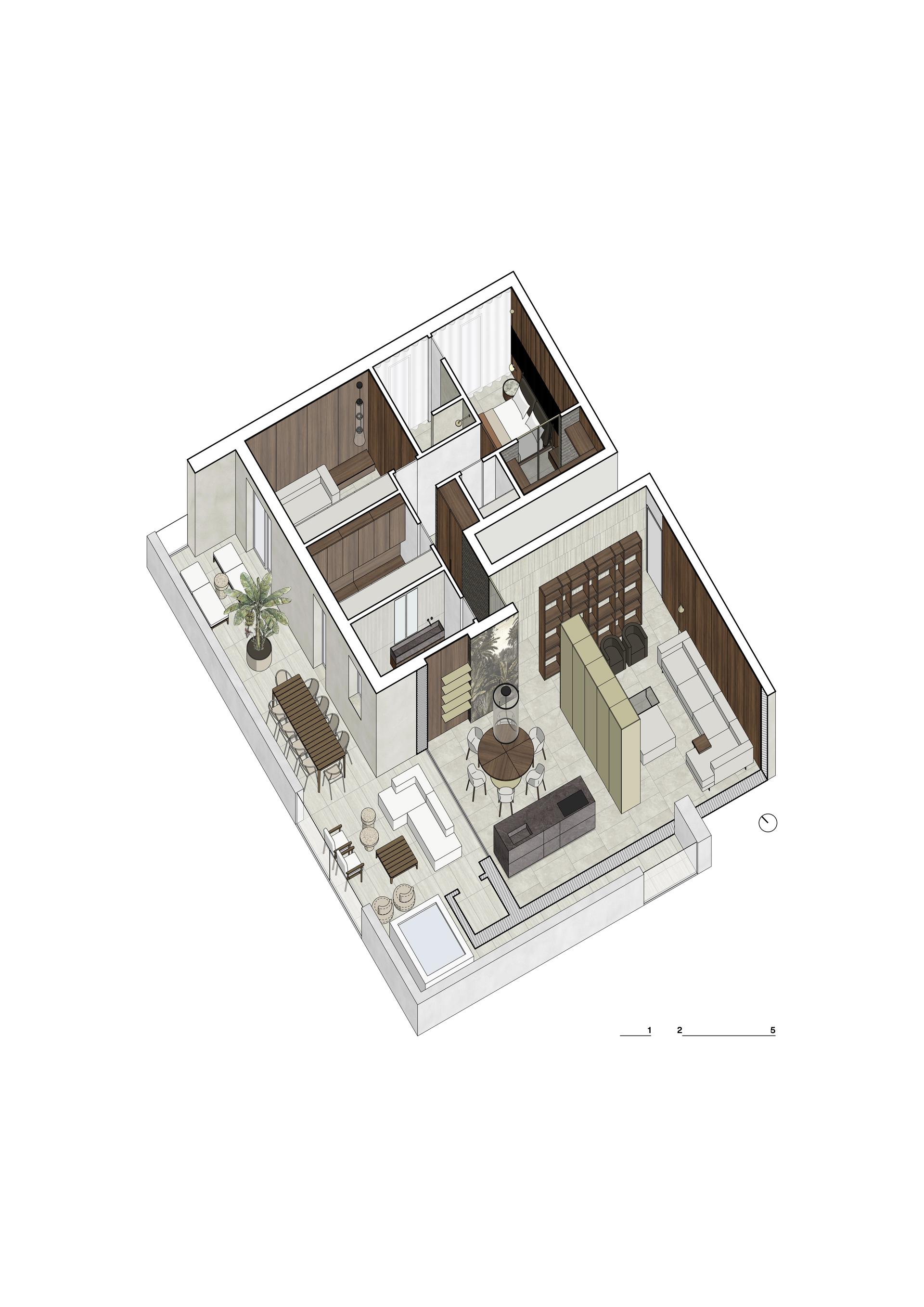
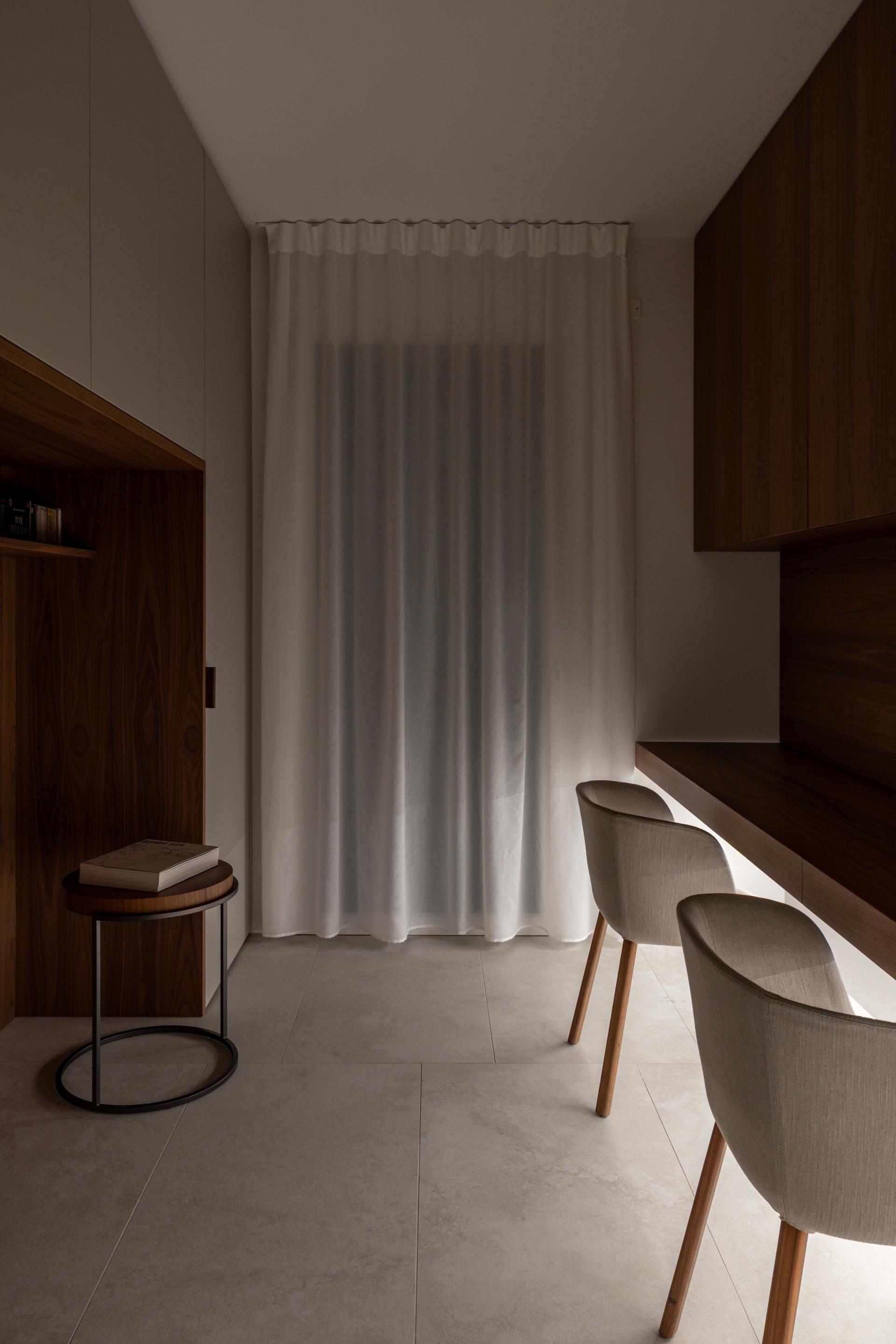
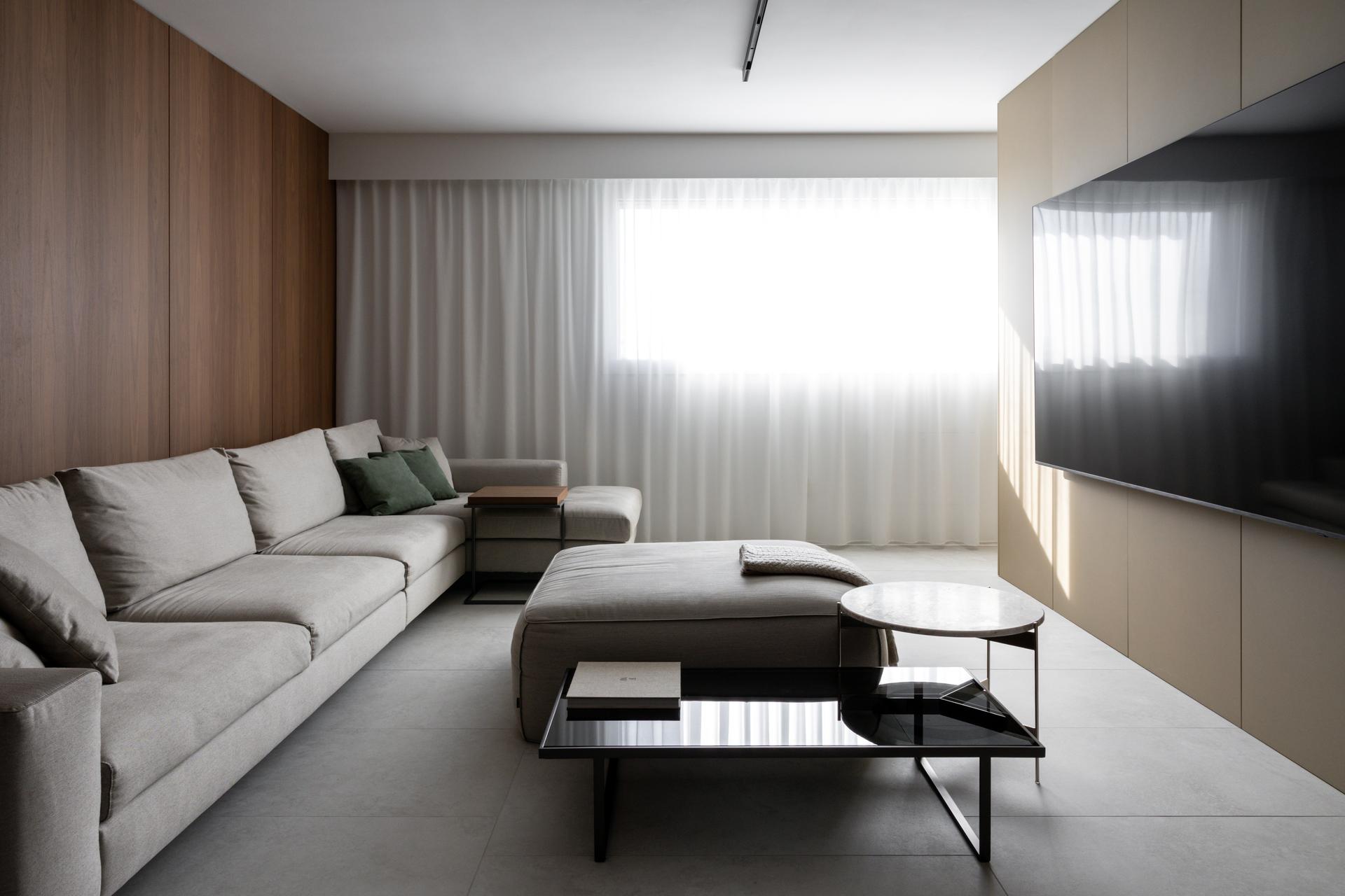
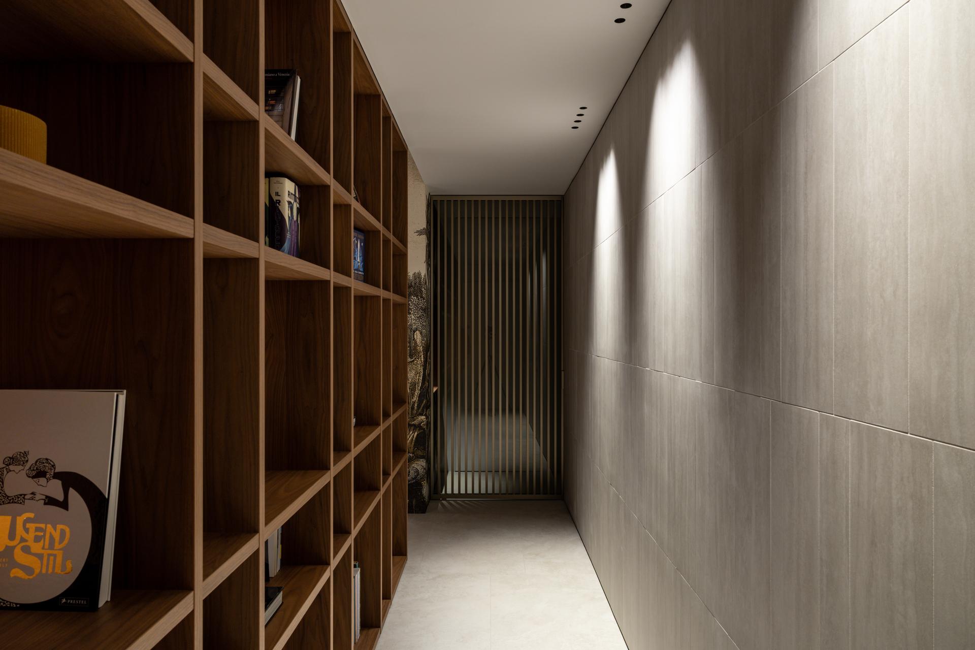
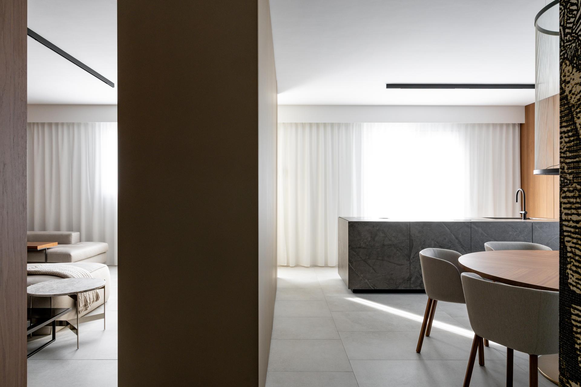
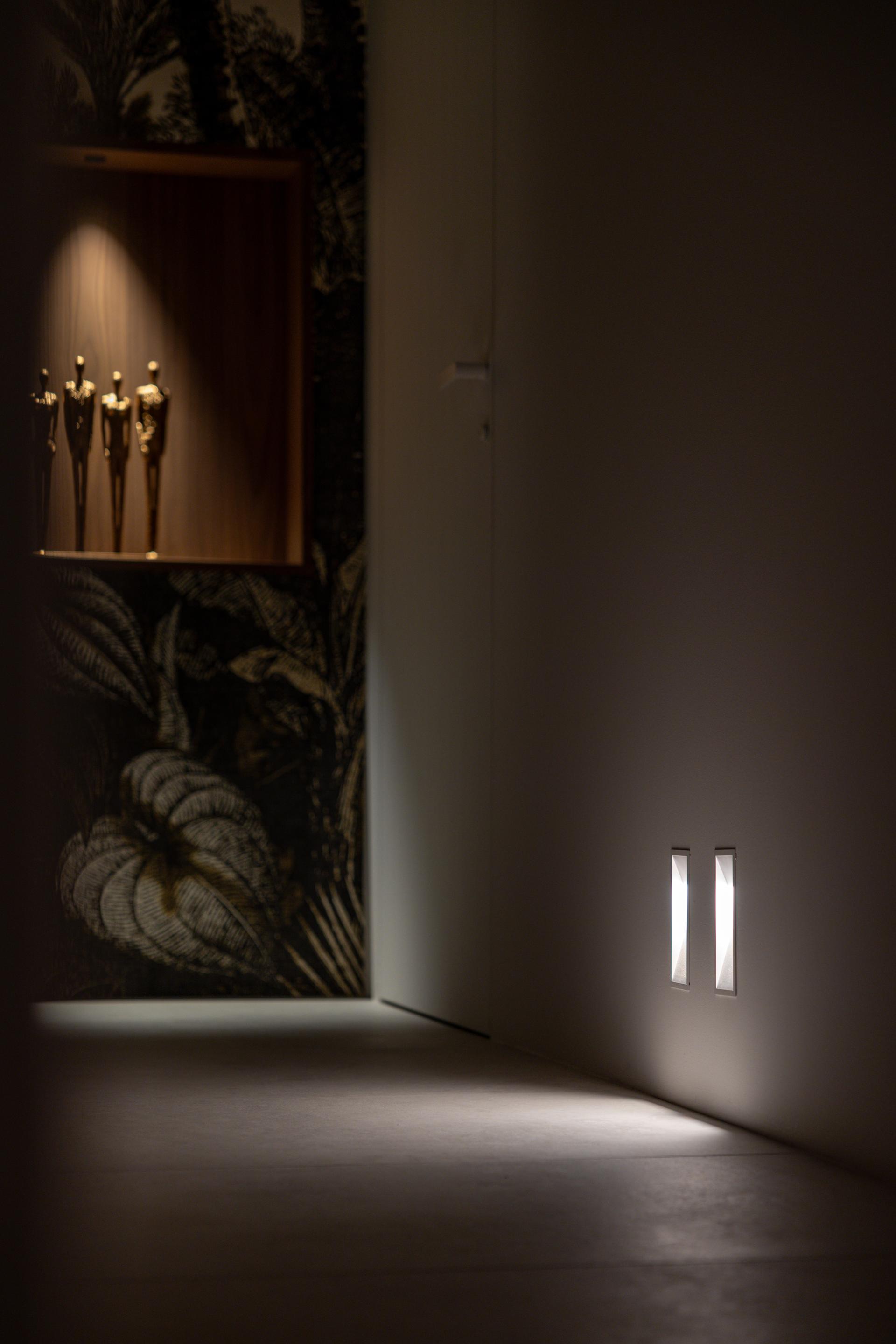
Completed in 2025, Opera Prima is a 130 sqm penthouse with a 62 sqm terrace in Vigonza (Padua), designed by Filippo Carraro and Stefania Casarin of Studio Eigen. The residence features an open-plan layout in which traditional partitions are replaced by a sequence of functional dividers. Visual continuity is central to the layout: a champagne-coloured metal screen connects the living and dining areas, while Canaletto walnut used for wall panelling and bespoke furniture combines with stone-effect porcelain stoneware to create a coherent design language.
“The clients wanted an intimate home with a strong identity, combining domestic warmth with understated contemporary elegance. That approach guided our choice of materials. The combination of travertine as the key design element and Canaletto walnut creates a rich interplay of textures that gives the interiors a sense of balance and sophistication,” said the architects.
Caesar’s travertine-inspired Iconica porcelain stoneware collection serves as the unifying material running through the entire project. Used from the living area and terrace to the bathrooms and entrance, it appears in a range of finishes while retaining a consistent colour palette that visually unifies the spaces. “We chose Caesar’s Iconica collection as the common thread running through the project to give the home a distinctive identity and a consistent visual language,” the architects said. “The reference to travertine, a stone deeply rooted in Italian architectural tradition, gives the interiors a timeless quality. Iconica also combines naturally with the project’s other principal material, Canaletto walnut, used for wall cladding and panelling throughout the home. Together, the two materials enhance the contrast between the solidity of stone and the warmth of wood.”
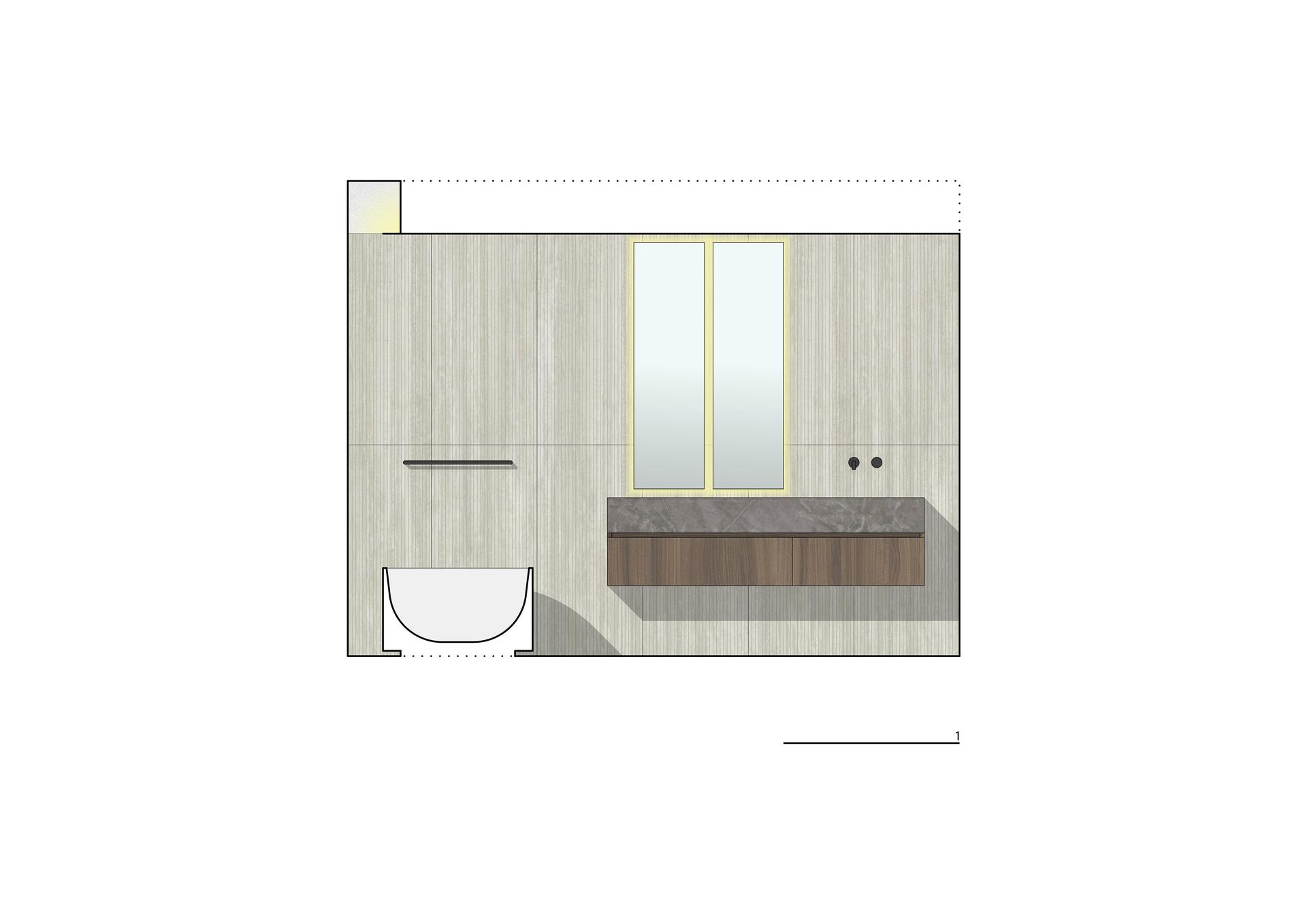
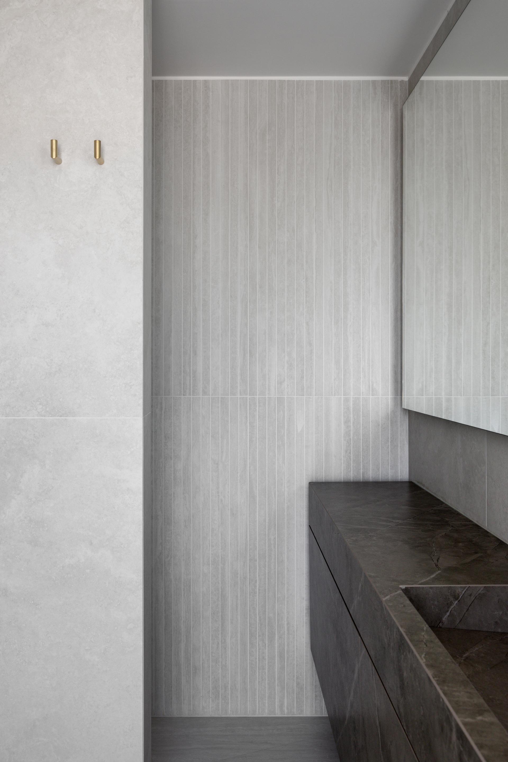
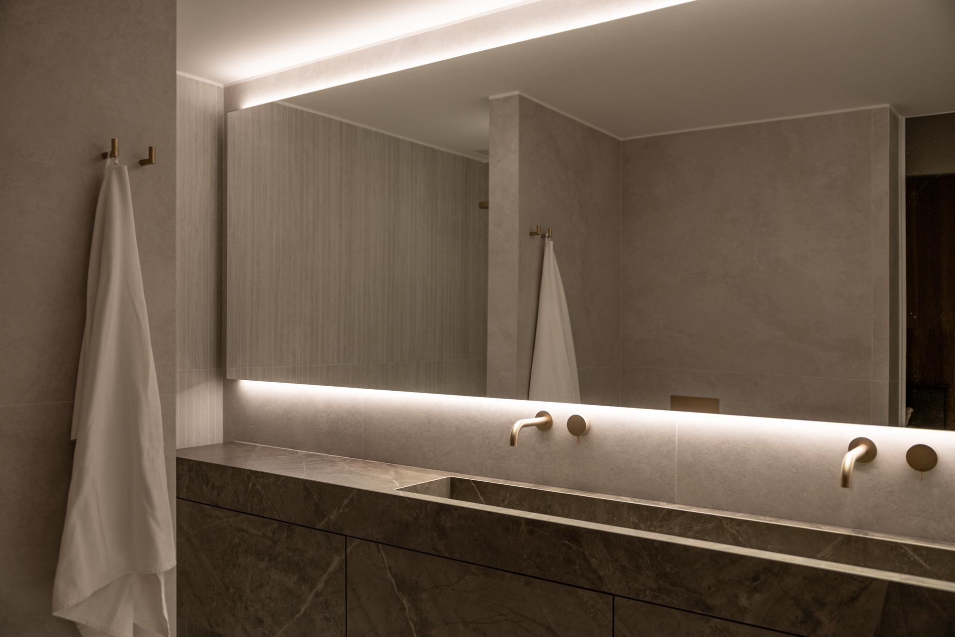
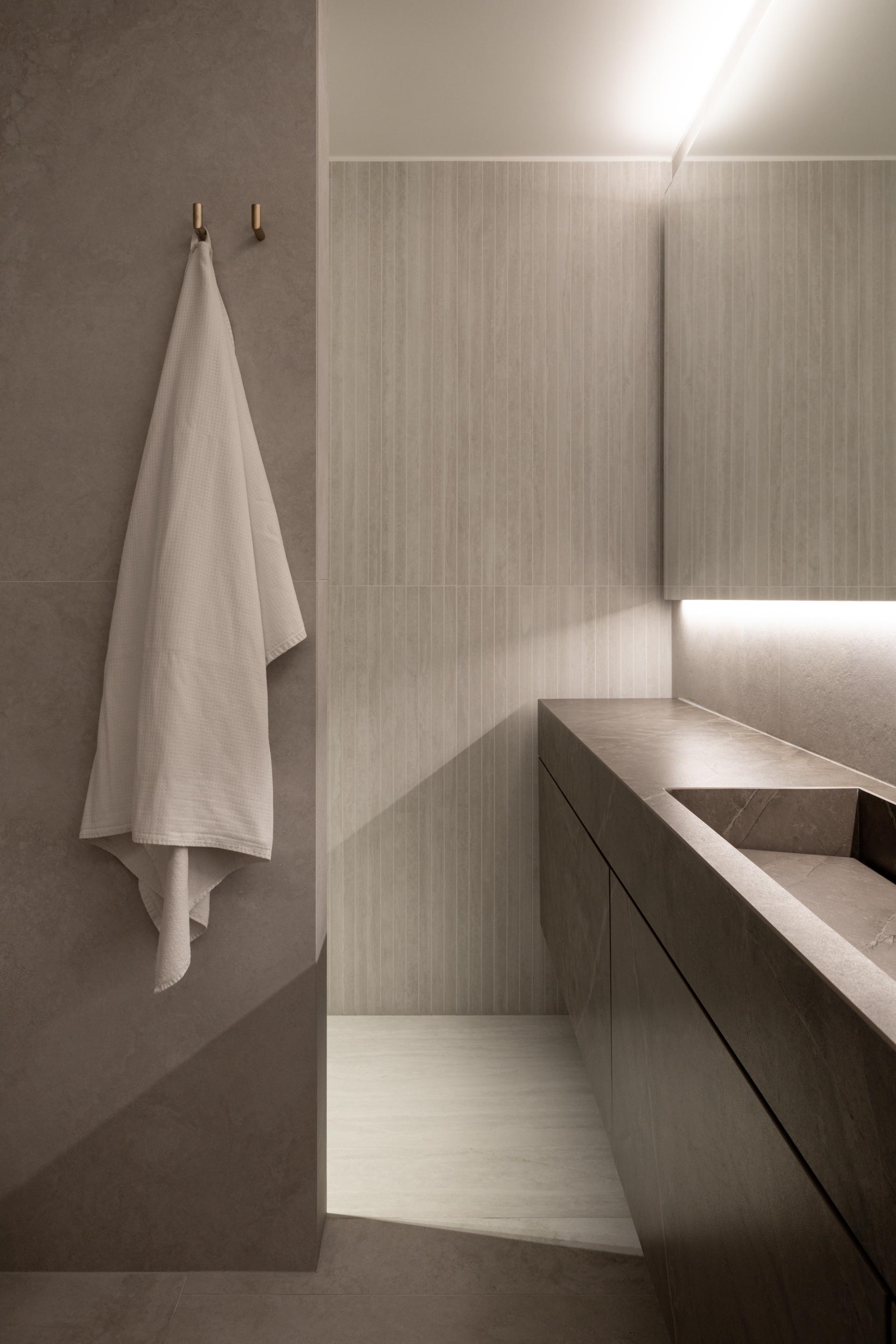
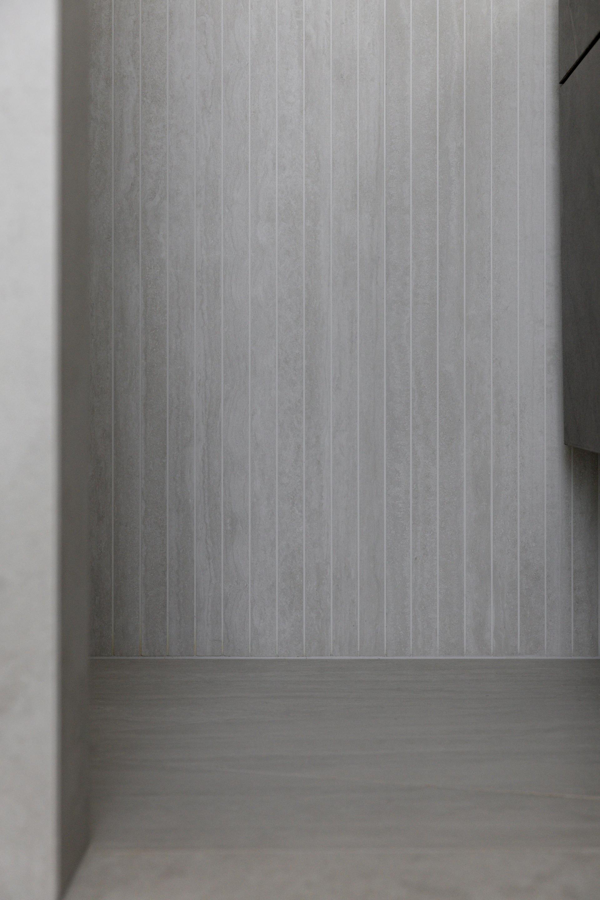
The different surfaces help distinguish each area of the home: “The idea behind using different finishes was to explore the expressive potential of travertine. Large Navona Contro slabs are laid in a staggered pattern on the floor to create a dynamic rhythm, while the entrance wall uses Navona Verso in a mosaic layout, breaking up and recomposing the linear vein-cut pattern into a livelier texture. “In the bathrooms, the ribbed finish of Navona Verso adds depth and creates subtle variations of light and shadow.”
The project also takes a long-term approach to sustainability, favouring durability over obsolescence through a restrained material palette, durable porcelain stoneware surfaces and a design language that outlasts passing trends. Complete the interiors are furniture and accessories by Pianca, Fantini taps and fittings, lighting by Vibia, Flos, FontanaArte and Nomon and a selection of finely crafted objects.
porcelain stoneware
Iconica
Navona contro, Navona verso, Navona Straight
120x120, 60x120 - 9 mm
Certifications
ISO 9001, ISO 14001, ISO 45001, ISO 17889-1, EPD, LEED, NF UPEC
More info on the product > go to the catalogue