Communication


Art as metaphor in the new Ceramics of Italy campaign
(May 2026) – An ornate, gilded Baroque frame hangs against a blank, minimalist wall. But instead of a traditional painting, the frame reveals a stylised red square with fragmented edges, the iconic logo designed by the agency Armando Testa in 2000 for the Ceramic Tiles of Italy trademark. To the right, a figure with short hair and a blue jacket looks closely at the artwork, caught in a moment of quiet admiration.
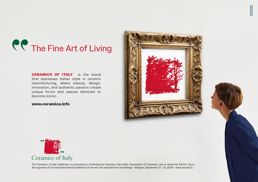
This striking image is the new visual identity that will be used for the Ceramics of Italy communication campaigns over the coming years. The concept plays on the dialogue between classical art and contemporary innovation, underscoring the role of Italian ceramics as a modern form of artistic expression firmly rooted in tradition.
The accompanying tagline, “The Fine Art of Living”, serves as a reminder that while the brand is fundamentally about the home, it is equally about art, an expressive language that unites creative design with emotional resonance.
Commissioned by Confindustria Ceramica and created by the agency Interpromex, this new artistic concept adds a new chapter to the brand’s visual history, joining some twenty different concepts developed over the collective trademark’s 50-year existence.
Interpromex uses art as a metaphor to emphasise the unique contribution that Ceramics of Italy products bring to architecture and design, products whose quality and aesthetic value make them worthy of a place in a museum collection. The concept is a celebration of both fine art and the “art of living”, a perfect synthesis of everything Made in Italy stands for.
Rather than focusing on a specific product, the campaign highlights the brand that has represented the industry on the global stage for over five decades.
The words accompanying the 2000 graphic restyling by the Armando Testa agency remain remarkably relevant today:
“The new Ceramic Tiles of Italy trademark looks to the future with the strength and awareness of a prestigious past and the confidence of an undisputed leadership. The fracturing boundary lines symbolise an industry that is projected outwards towards the world, driven by the certainty of its role as a leading global player. The quotation marks denote the rigour, excellence and uniqueness of Italian products, an identity defined by advanced technology and state-of-the-art techniques, innovative products and processes and a pioneering approach to design and end use.”
Ceramics of Italy: what it is and who it represents
The Ceramiche italiane trademark was established in 1972 to promote Italian ceramic tiles both at home and abroad, a pioneering initiative within the country’s industrial landscape at the time. The mark subsequently evolved to Ceramic Tiles of Italy and finally in 2011 to Ceramics of Italy, now representing tiles, sanitaryware and tableware.
By denoting the product’s geographical origin, the trademark embodies the values for which the Italian ceramic industry is recognised worldwide: quality, transparency, pioneering design, product and process innovation and environmental and social sustainability.
Confindustria Ceramica member companies licensed to use the Ceramics of Italy mark must adhere to specific regulations governing its use. The mark remains central to the Association’s promotional activities both in Italy and abroad and may only be used for ceramic products manufactured entirely in Italy.
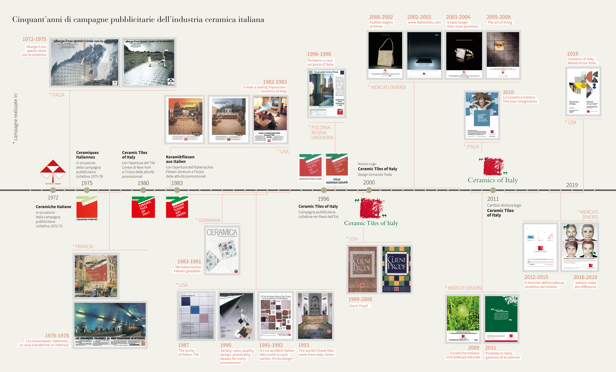
Fifty years of advertising campaigns by the Italian ceramics industry