










Products Trends


Ceramic surfaces use touch, light and colour to shape spaces
(September 2026) – “The tile becomes a surface on which traces of the hand are intentionally left visible,” observed Kengo Kuma when discussing his ceramic project Three Elements, One Matter. This reflection highlights one of the most significant trends in contemporary surface design: marks, reliefs and irregularities are no longer secondary decorative effects but design tools through which material, light, colour and space interact.
Tactile textures should not therefore be seen simply as a return to decorative surface effects, but rather as the result of technological advances that allow surface structure and graphics to be coordinated with ever greater precision. Micro-engravings, grit applications, selective variations in opacity and reliefs synchronised with veining or mineral inclusions combine to create surfaces that appeal to both sight and touch. As a result, ceramic materials can evoke the layered qualities of stone, the grain of timber, woven textiles, textured concrete or hand-shaped clay, while retaining their inherent durability, stability and ease of maintenance.
In a world where much of everyday life is experienced through the perfectly smooth screens of digital devices, interior design is rediscovering a different kind of physical experience. It is not simply about wanting to touch something tangible: the sensory aspect conveys information about the scale, density and character of a space. A fluted wall, a granular surface or an engraved module establishes a relationship with the body, either inviting touch or keeping it at a distance, allowing architecture to be perceived as a material presence rather than merely an image.
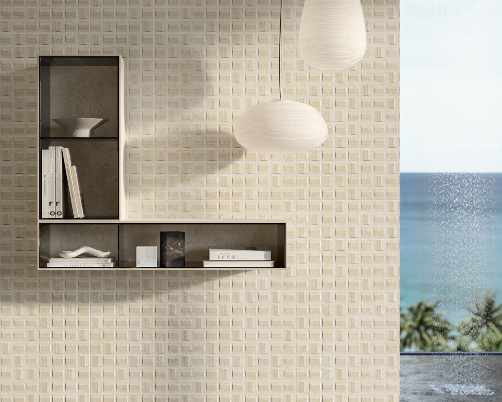
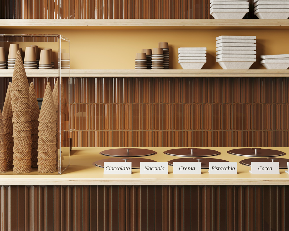
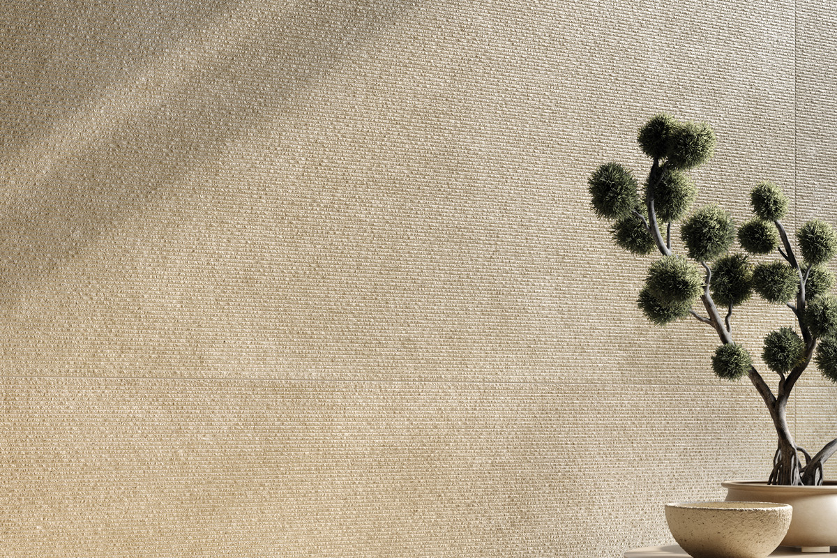
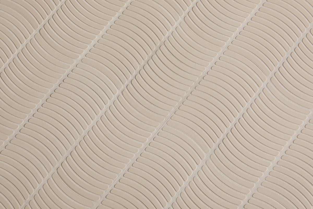
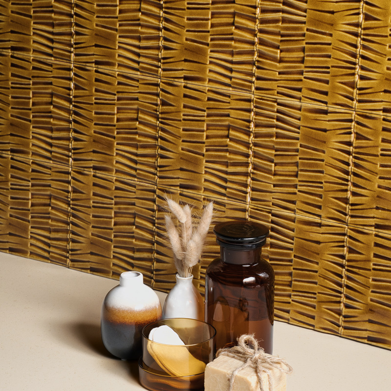
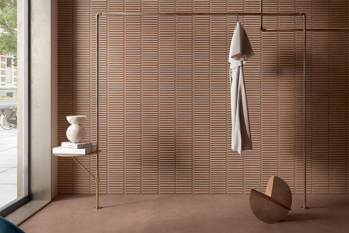
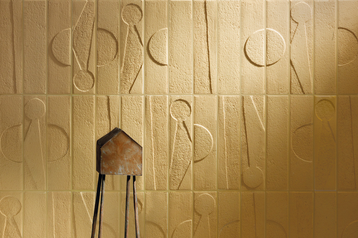


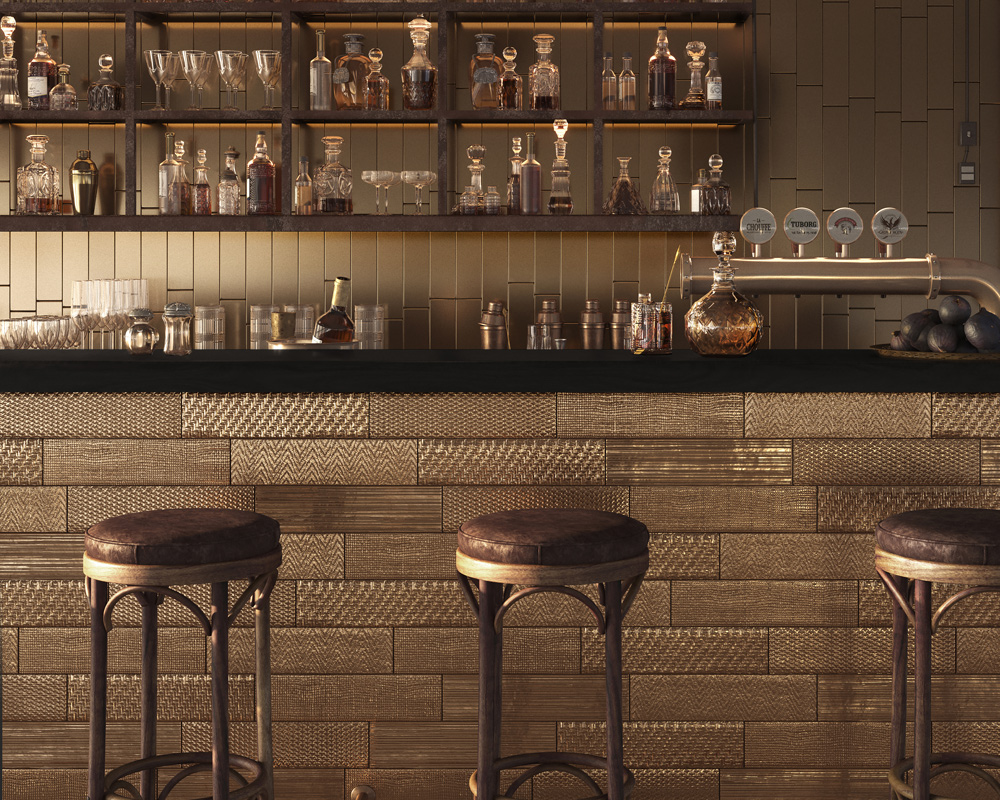
Three-dimensionality also transforms the way light behaves. Linear structures, faceted modules and bas-relief patterns cast shadows that change in depth throughout the day and according to the observer’s viewpoint. The perception of the surface is never static but changes with the light: it appears more compact under front lighting and more articulated under raking light. The interplay of matt, satin and glossy finishes introduces further perceptual nuances, creating rhythm and hierarchy without the need for applied decoration.
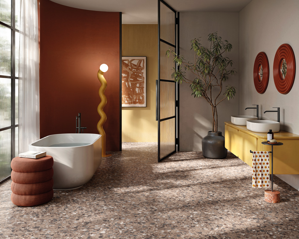
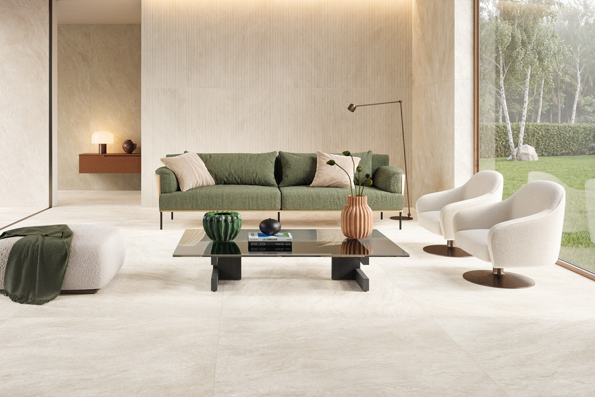
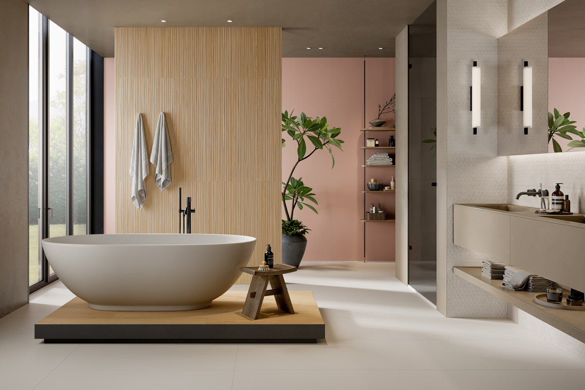
This approach is accompanied by a colour palette centred on earthy tones: sand, limestone, mineral beige, clay, terracotta, ochre, rust and tobacco, enriched with accents of olive, sage and moss green. Together, these colours form a cohesive palette that connects different surfaces and lends itself to harmonious tone-on-tone compositions.
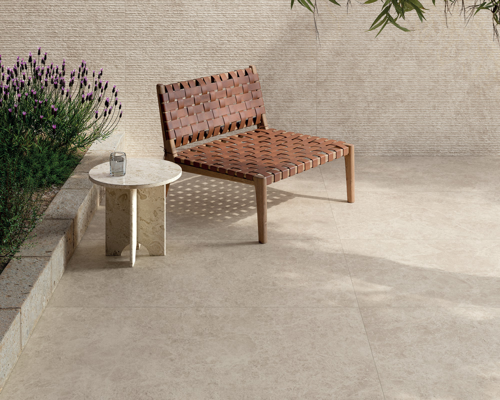
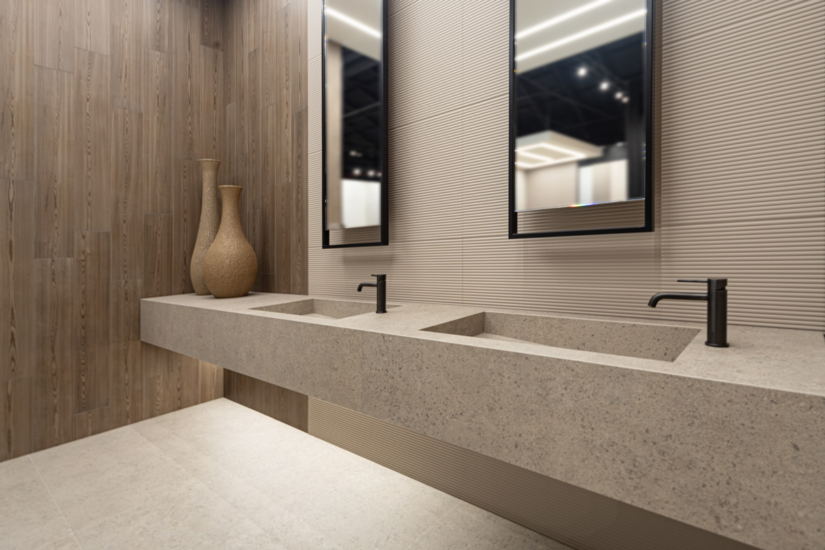
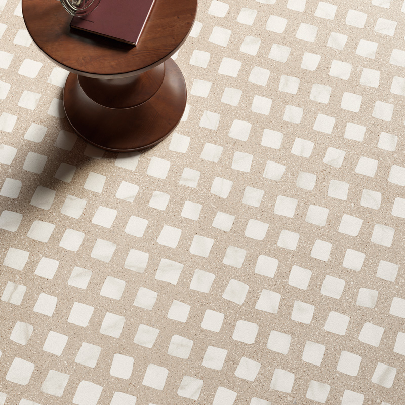
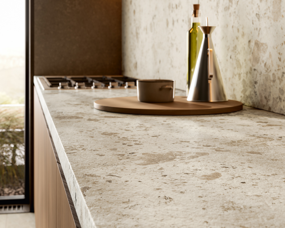
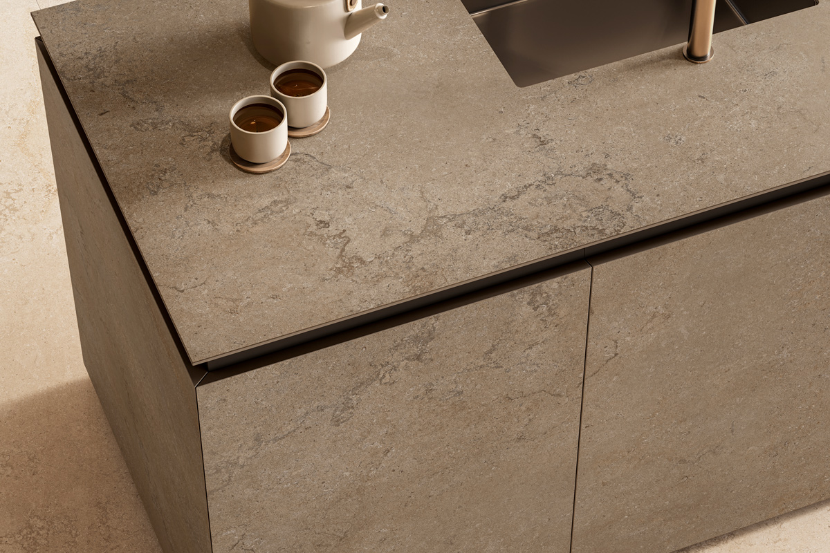
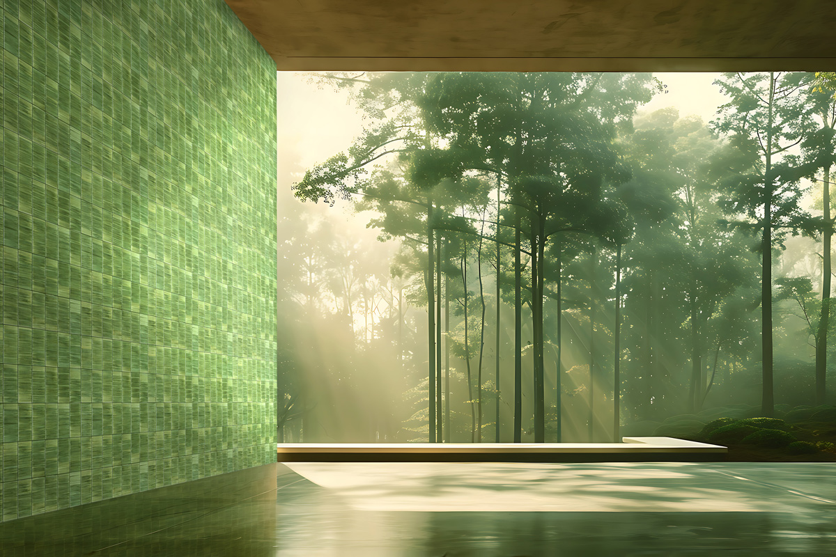
The sense of balance and tranquillity found in interiors dominated by these hues depends largely on how they are used and combined. Soft contrasts minimise abrupt visual interruptions; closely related shades promote continuity; and beige and sand reflect light more gently than pure white. Ochre and terracotta introduce warmth and depth, whereas deep browns and greens lend stability to the composition and strengthen its visual relationship with the surrounding landscape.
The reference to nature does not necessarily involve literal reproduction; it can also emerge through abstraction. This is exemplified by the work of Federica Biasi, who transformed the memory of overlapping terracotta roof tiles seen in Asian villages into an engraved module that is ordered, repeatable and architectural. The original inspiration is translated into structure, proportion and rhythm: intrinsic elements of architectural language.
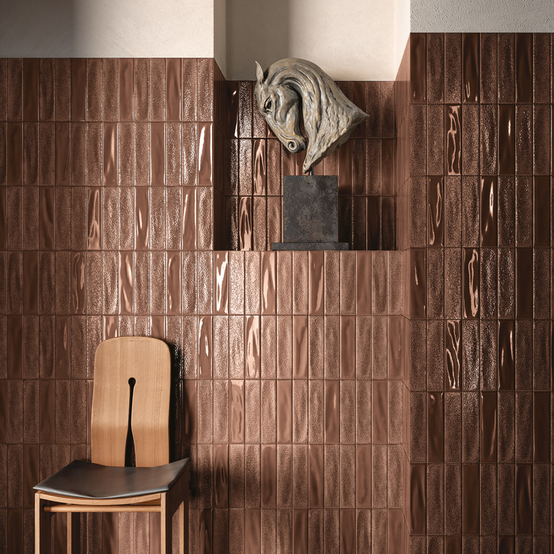
Texture and colour achieve their most compelling results when carefully calibrated together. A pronounced relief can be tempered by a uniform tone, while an intense colour can gain depth through subtle variations in surface texture. Glossy finishes enhance copper, tobacco and terracotta shades, whereas matt finishes reveal the powdery qualities of clay, concrete and stone more clearly. On lighter tones, even a shallow relief can cast precise, well-defined shadows.
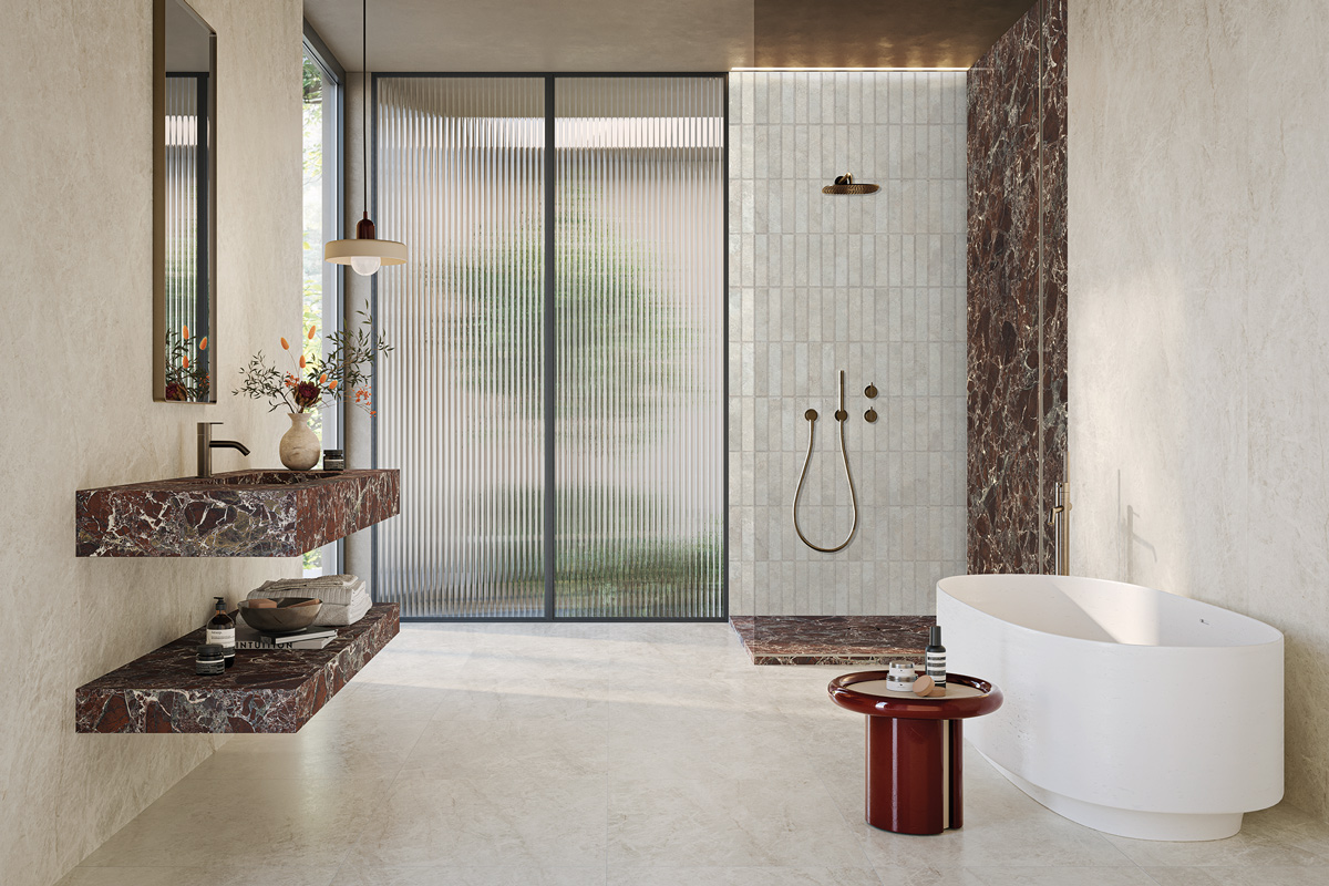
The direction of contemporary research is therefore not towards an accumulation of effects, but towards their careful modulation. Surfaces acquire a truly architectural role when relief, colour and light combine to organise space, mediate the transition between indoors and outdoors and differentiate functions within the built environment.